Consider multiple aspects of type design to create two unique typography designs, supported by examples and contextual usage, work in progress and variants.
Digital typeface
When looking at the use of typography there are different varieties and ways that you can use type to express the look, theme or feeling that the designer wants the audience to feel or relate to. There are thousands of different types of typography. And being given the challenge to create 2 different/ new typefaces can be daunting. For my first typeface being digital I started off by looking into the types of middle/ Tudor typeface.
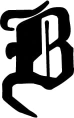
Fig 1.
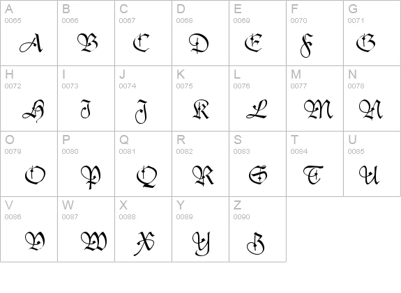
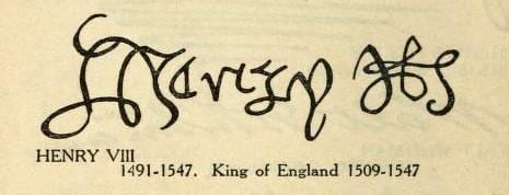
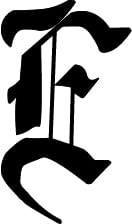
Fig 2.
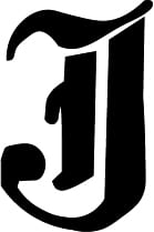
What I liked about the typeface was how each of the letter were presented. with having each of them being individual. With the use of different line that would have been used to define the letter’s. what I found commonly used in the typeface was the ending of the letter stroke where sharp pointed. This has shown to be a hard and sharp typeface. However I want to take on the challenge of changing the stroked ending of the type face so that it would maybe challenge that meaning of the letters themselves.
What I wanted to do when creating my own tudor style typeface was to having the letters challenge the conventional styles of what the traditional tudor typeface would be. With the traditional style I found that it has a flow through the letters and is a continuous stroke. With the end of the letter you can see that some of the letters are sharp where the letters finishes. With the tudor typeface the lines and how much ink was used was very thin and I would also challenge that with my typeface.
With my digital typeface I wanted it to be a very bold and heavy weighted typeface. I had to consider that when used it could be too difficult for someone to read in a full document such as a leaflet or a poster to a medieval/ tudor historical sight. With the typeface I also changes the way in which the edging of the letters; having a more rounded edge. This give it a more softer/ cartoon style to the typeface. My typeface does remind me of the large letter that is used at the start of stereotypical fairytale books to emphasise the first letter of a chapter.
Final designs
Physical Typeface
For my physical aspect of typography I looked into using different materials for the type face. One that I particularly enjoy was the use of Thread. There are various ways that people used thread such as placing pins and nails on a board or other background to create the outline of the typeface and then wrapping the thread around them. Then there is using the thread the sow through the paper to create the letters.When I was looking through various different typography styles I was attracted to the idea of using sowing to create a typeface because i liked the look and the feel of the end product, as well as the colours that i could use. Looking at different example. I found that most of the way that the letter were executed was by parallel line.
With creating the same style of using the parallel lines I found that it was a lot more challenging to make it look like a letter whilst using less lines. However, after doing some of the same styles I looked at the back of the paper which I used and found that I was more interested in having the lines no being parallel and muddled the lines to be different scales, whilst still creating the letter. I feel like this technique made the final product abit more obscure and has more character.
Fig 3.
Due to running out of time I was unable to finish the sewing of the letter and also upload images to the blog.
Reference:
Fig 1.
Unknown (2016) Tudor Script SSi Font – FontZone.net.http://fontzone.net/font-details/tudor-script-ssi[Accessed 9 December 2016]
Fig 2.
Unknown (2016) King Henry Viii Famous Quotes. QuotesGram.http://quotesgram.com/king-henry-viii-famous-quotes/[Accessed 12 December 2016]
Fig 3.
Pinterest (unknown) Pinterest. https://uk.pinterest.com/[Accessed 9 December 2016]
You can go Here to see the above fonts